CyberLink PowerDirector 7 Menu Designer Tips & Guidelines
CyberLink PowerDirector 7 provides you with several stylish pre-designed templates that you can use to create your disc menu. You can also design disc menus from scratch, creating your own custom and original menu templates.
The following are helpful tips and guidelines to achieve the best results when creating and modifying disc menus within CyberLink PowerDirector 7.
Disc Menu Structure
All of the menu templates within CyberLink PowerDirector 7 are multilayered, containing up to three of the following menu pages that you can individually design and customize:
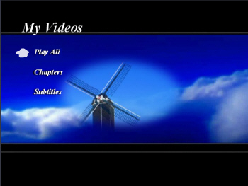
Main page (root menu)
This is the landing page that contains your movie title and links to play your movie, and both the chapters and subtitles pages.
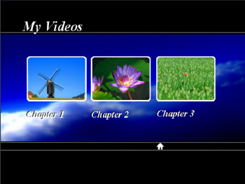
Chapters page
The chapter page contains either chapter thumbnail buttons or chapter text links. The exact content depends on which menu template you selected, whether you added chapters in the Chapter Room and how many buttons per page you selected.
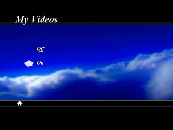
Subtitles page
The subtitles page allows you to turn subtitles on or off if included them on your disc. The Subtitles page within disc menus will only be available if you selected Create subtitles for disc when creating subtitles in the Subtitle Room.
Customizing Your Menu Style
CyberLink PowerDirector 7 gives you full creative control over the look and creation of your disc menu. However, all disc menus consist of the following common elements:
Background Image
Choosing the right background for your disc menu will make it attractive and give it personal style. Each menu page can have its own custom background, so select the page you'd like to edit and import a custom background image by clicking 
Recommended image sizes
- Wide screen (16:9): 1280x720 pixels
- Normal (4:3): 960x720 pixels
Chapter Thumbnail Buttons
When customizing the Chapters page of your disc menu, you can import your own custom chapter thumbnail buttons. Each chapter button is made up of three images:
To import your custom thumbnail buttons, select the Chapters page
and then select Set Button Effects. 

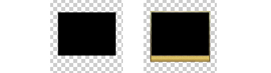
A thumbnail button's frame can be an image of any shape that you prefer, but rectangular or oval shapes are recommended to ensure the visibility of your thumbnail video preview. PNG image files are recommended for transparency and quality, with an empty transparent area in the middle that will display the thumbnail video. For example, the image below has a transparent region in the middle and around the frame:

The transparent section on the outside of the frame in the image is included in its size.
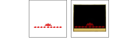
The button mask image is used to define the thumbnail region your video is displayed in. The entire image should be the exact same size as the button frame image you are using, with a solid color thumbnail region where the video is displayed (the empty area in your frame), indicated in black below. The rest of the image must be transparent.
For example:
The highlight image is the effect that is displayed when a button has focus, i.e. the hover effect. For Chapter thumbnail buttons, the highlight image is usually similar to the button, with a slight difference to indicate focus, for example a color change. For Main and Subtitle menu buttons, the highlight image is a small icon, for example an arrow.

The chapter thumbnail highlight should be the same format and size as the button frame image, with a change in color or a modification in design so that it clearly indicates when it has focus in your menu. The background of the highlight image should be white in color, with the highlight color being contrasting from to your frame and video color.
Recommendations:
- Frame, Mask, Highlight, Images: 400x400 pixels (max. 512x512 pixels)
- Highlight color: Your highlight color should be contrasting to your frame and video color
- Format: .PNG
Note: The maximum size for Main and Subtitle menu highlight icons is 96x96 pixels.
Navigation Buttons
You can also import your own custom navigation buttons for your disc menu. Navigation buttons are a set of four - HOME, UP, NEXT and PREVIOUS buttons for browsing through your menu pages. You may only customize the look of these buttons; the highlight color is predetermined depending on the menu template you working with. To import your own custom navigation buttons, select the Set button effects tab and then click on the Change navigation button.
Button Image
Each navigation button can be individually customized and then imported into the Menu Designer. The navigation button image may be any .PNG image of any shape that you like, but the icons should be meaningful and precise to indicate the functionality of all four buttons. It is possible to customize only a one of the four icons on the button, but it is best if the whole set is customized for consistency.
Recommended image sizes and format:
- For all resolutions: 64x64 pixels
- Image format (required): .PNG
Easy and Readable Text
Some disc menu templates use clickable text instead of thumbnail buttons. The color of this text and for your disc and chapter titles should be carefully selected. The colors should have good contrast against the background image and allow room for about 10-20 characters, without overlapping any of the other elements on the screen. The drop shadow effect may be a good way to increase your text visibility.
Additional Resources
Free software to help you create .PNG images
http://www.getpaint.net/ (free)
https://www.adobe.com/cfusion/tdrc/index.cfm?product=photoshop (trial)
