


Hot Pink Color: Everything You Need to Know

- What Color is Hot Pink?
- How to Make Hot Pink?
- What Colors Go With Hot Pink?
- What Colors Match Hot Pink?
- What Colors are Similar to Hot Pink?
- The History of Hot Pink
- What Does Hot Pink Symbolize
- Working Creatively With Hot Pink
- How to Create a Social Media Post, Graphics, and Videos With Hot Pink
What Color is Hot Pink?
Hot pink is a vibrant and intense shade of pink that's impossible to miss. It's a playful and bold color that can make a statement in any setting. Hot pink is often associated with femininity and confidence and can add a pop of fun to any outfit or decor. Studies have shown that the color pink is often interpreted as being associated with love, compassion, and nurturing. Interestingly, research has also shown that women tend to prefer pink slightly more than men. So, if you want to add a burst of boldness and femininity to your life, hot pink is the way to go!
How to Make Hot Pink?
To create hot pink, you can mix white and red paint to achieve the desired shade. Alternatively, you can also mix red and magenta or fuchsia to get a similar hot pink hue.
HEX color code for hot pink is #FF69B4, which is a combination of red and blue hues.
RGB values are R: 255, G: 105, B: 180.
CMYK code is 0, 59, 29, 0.
When it comes to web design, the Web Safe code for hot pink is FF66CC.
So, whether you're painting a room or designing a website, now you know how to create the bold and vibrant color of hot pink!
What Colors Go With Hot Pink?

Hot pink is a vibrant and eye-catching color that can add a pop of fun to any outfit or decor. It's a bold and confident choice that's sure to make a statement. Whether you're wearing a hot pink dress or decorating your room with hot pink accents, it's a color that's impossible to ignore. Hot pink can be paired with neutrals like black and white for a more classic look or with other bright colors for a more playful vibe. So, why not embrace the power of hot pink and add some boldness to your life?
What Colors Match Hot Pink?

Hot pink is a bold and vibrant color that can be paired with various other hues to create a cohesive and stylish look. Some colors that match well with hot pink include:
- Black: Hot pink and black is a classic combination that adds sophistication and elegance to any outfit or decor.
- White: Hot pink and white is a fresh and clean pairing that creates a bright and cheerful look.
- Gold: Hot pink and gold is a luxurious and glamorous combination that's perfect for adding a touch of sophistication to any outfit or decor.
- Silver: Hot pink and silver is a modern and edgy pairing that creates a bold and trendy look.
- Purple: Hot pink and purple are a fun and playful combination that creates a vibrant and energetic look.
- Green: Hot pink and green is a fresh and lively pairing that's perfect for creating a bold and colorful look.
Overall, hot pink is a versatile color that can be matched with a wide range of other hues to create a stylish and cohesive look.
What Colors are Similar to Hot Pink

Colors that are similar to hot pink include:
- Fuchsia: Fuchsia is a bright and bold pink hue that's very similar to hot pink. It's a slightly darker shade that has a slightly more purple undertone.
- Magenta: Magenta is another bright and vibrant pink hue that's similar to hot pink. It has a slightly more blue undertone than hot pink.
- Raspberry: Raspberry is a deep, rich pink color that's similar to hot pink but has a slightly darker and more muted tone.
- Coral: Coral is a pink-orange color that's similar to hot pink but has a softer and more subdued tone.
- Rose: Rose is a pale pink color that's similar to hot pink but has a lighter and more delicate hue.
Overall, many different colors are similar to hot pink, ranging from bright and bold hues to softer and more muted tones.
The History of Hot Pink
Hot pink, also known as neon pink, is a vibrant shade of pink that first gained popularity in the 1960s. The color was created by the Italian fashion designer Elsa Schiaparelli, who was known for her bold and innovative designs.
Schiaparelli introduced hot pink to the fashion world in 1937 with the release of her Shocking Pink collection. The color was an immediate sensation and soon became associated with Schiaparelli's avant-garde style and rebellious spirit.
In the 1950s and 1960s, hot pink symbolized youth culture and counterculture movements. It was worn by musicians and artists and became associated with rebellion and non-conformity.
Today, hot pink continues to be a popular color in fashion and design and is often used to create bold and eye-catching looks. It remains a symbol of individuality and self-expression and is a favorite color among those who want to make a statement with their style.
What Does Hot Pink Symbolize?
Hot pink is a vibrant and bold color that is often associated with a variety of symbolic meanings. Here are some of the most common symbolic associations of hot pink:
- Love: Hot pink is often associated with love and romance and is a popular color for Valentine's Day gifts and decorations.
- Femininity: Hot pink is often seen as a feminine color and is often associated with traditional notions of femininity, such as beauty, grace, and delicacy.
- Youth: Hot pink is often associated with youthfulness, energy, and vitality. It's a popular color among young people and is often used in clothing and accessories for children and teenagers.
- Boldness: Hot pink is a bold and eye-catching color that is often used to make a statement or draw attention to something.
- Playfulness: Hot pink is often associated with playfulness, fun, and whimsy. It's a popular color for toys, party decorations, and other items that are meant to be playful and lighthearted.
Overall, hot pink is a versatile color that can symbolize a wide range of emotions and ideas, depending on the context in which it's used.
Working Creatively With Hot Pink
Hot Pink and Interior Design

Image from ApartmentTherapy.
Hot pink can be a bold and playful color for interior design. Here are some tips on how to work creatively with hot pink:
- Use it as an accent color: Hot pink can be overwhelming if used too much, so it's best to use it as an accent color. Consider using hot pink throw pillows, curtains, or a rug to add a pop of color to a room.
- Pair it with neutrals: Hot pink pairs well with neutrals like white, gray, and beige. These colors help to balance out the bright and bold nature of hot pink, creating a more cohesive and harmonious look.
- Mix and match with other bright colors: Hot pink can be paired with other bright colors to create a playful and energetic look. Consider pairing hot pink with bright yellow, turquoise, or orange.
- Use it in unexpected ways: Hot pink doesn't have to be limited to traditional decor items like pillows or curtains. Consider using hot pink in unexpected ways, like painting the inside of a bookshelf or adding hot pink accents to a light fixture.
Overall, hot pink can add a fun and playful touch to any interior design scheme. By using it in moderation and pairing it with the right colors, hot pink can help to create a vibrant and welcoming space.
Hot Pink and Photography

Hot pink can be a fun and eye-catching color to incorporate into photography. Here are some tips on how to work creatively with hot pink:
- Use it as a background: A hot pink background can add a pop of color to your photos and create a playful and energetic look. Use hot pink seamless paper as a backdrop for your next photo shoot.
- Incorporate it into your subject: If you're photographing people or objects, consider incorporating hot pink into the subject. This could mean using hot pink clothing or accessories or even painting an object hot pink.
- Use it as an accent color: Hot pink can be overwhelming if used too much, so it's best to use it as an accent color. Consider using hot pink props or accents in your photos to add a pop of color.
- Play with lighting: Hot pink can look different depending on the lighting conditions. Experiment with different lighting setups to see how hot pink looks in different contexts. You can also use colored gels on your lights to create a hot pink hue.
Overall, hot pink can add a fun and playful touch to your photography. By using it in moderation and experimenting with different techniques, you can create eye-catching and creative photos.
Hot Pink and Branding

Image from Dribbble.
Hot pink can be a bold and attention-grabbing color to incorporate into branding. Here are some tips on how to work creatively with hot pink in branding:
- Use it as a primary or accent color: Hot pink can be used as the primary color in your branding or as an accent color to add a pop of color to your logo or marketing materials.
- Pair it with other colors: Hot pink pairs well with other bold colors like black, white, and gold. Consider using these colors in your branding to create a cohesive and visually striking look.
- Consider your target audience: Hot pink can be a divisive color, so it's important to consider it before incorporating it into your branding. If your target audience is primarily young and trendy, hot pink may be a great choice. However, if your target audience is more traditional or conservative, you may want to consider a more muted color palette.
- Use it consistently: When incorporating hot pink into your branding, it's essential to use it consistently across all of your marketing materials. This helps to build brand recognition and creates a solid visual identity.
Overall, hot pink can be a powerful color to incorporate into branding when used effectively. By pairing it with other colors, considering your target audience, and using it consistently, you can create a visually striking and memorable brand.
Hot Pink in Film and Video
Hot pink can be a visually striking color to incorporate into film and video. Here are some tips on how to work creatively with hot pink in film and video:
- Use it as a lighting effect: Hot pink lighting can create a moody and surreal effect in film and video. Consider using hot pink gels on your lights to create this effect.
- Incorporate it into your set design: Hot pink can add a pop of color to your set design and create a playful and energetic look. Consider using hot pink props or set pieces to add this color to your scene.
- Use it in post-production: If you didn't capture hot pink during production, you can add it in post-production. Consider adding hot pink color grading or visual effects to enhance your footage.
- Pair it with other colors: Hot pink pairs well with other bold colors like black, white, and gold. Consider using these colors in your production design or wardrobe to create a cohesive and visually striking look.
Overall, hot pink can be a powerful color to incorporate into film and video when used creatively. By using it in lighting, set design, and post-production, and pairing it with other colors, you can create a visually striking and memorable production.
How to Create a Social Media Post, Graphics, and Videos With Hot Pink
-
Download the best editor for creating social media content, PowerDirector 365 Business.
Learn More
-
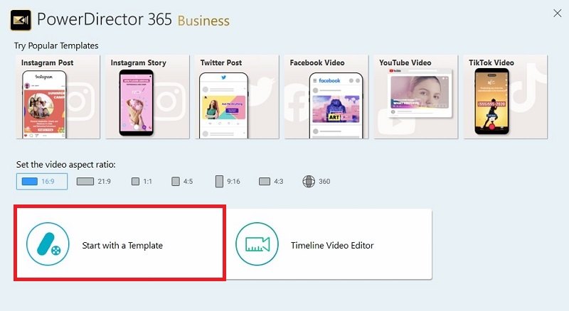
Open the software and Start with a Template.
- Select a template.
-
Open the Settings of the template and add hot pink to your Brand colors. This will automatically change templates to include hot pink whenever you open them.
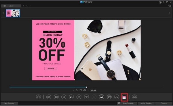
Tip: Add some of hot pink complimentary colors (black, white, gold, silver) to your Brand colors to ensure templates look their absolute best.
-
Customize your template and export it to share.


